What do we mean by "SLIDERS"?
A “slider”, is basically a set of boxes arranged in a row, and you can navigate between them by using links, buttons and slider bars.
Using some clever tricks in CSS, radio buttons, labels and background images can be used to provide suitable touch interactions. This is especially effective on mobile devices with browsers that have built-in features or can take advantage of certain WebKit tools.
Basic idea
- Create the slider layout
- Add slider navigation buttons
- Decide if you want to Remove the scrollbar
- Add jump links pointing to the relevant slide
Example: 1
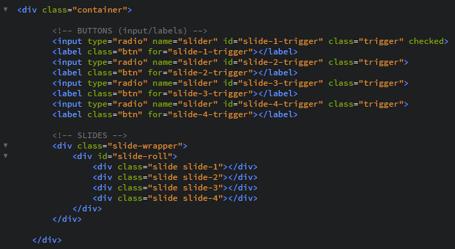
Here is the basic HTML structure used in the example below
As you can see, the entire slider is made from a set of div elements. A primary box to hold it all, followed by carefully labelled elements to take advantage of CSS teqniques.
Notice that the buttons are using input and label. Specifically adding a 'for' attribute to the label and an 'id' to the input.

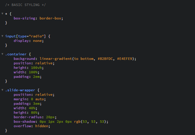
The CSS
Generally the main idea is using a div as a container, which can be set up in a few ways. Here we use display: flex to make it easy. But if you wish you can use flexbox, or you can use a CSS Grid.
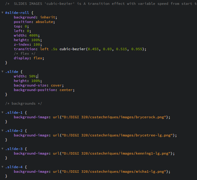
Using flex, displays everything in the contained space horzontally. The CSS code is used to mask the region and show our slides through an open window. In this case, each slide is shown as a background image applied through CSS.

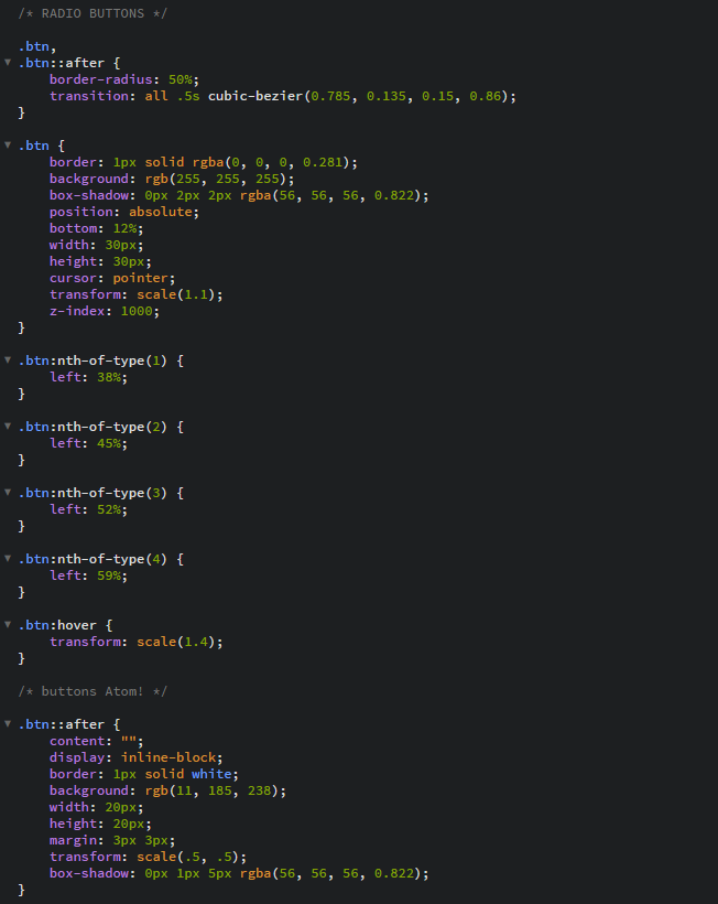
The motion of the transitions for the buttons and the images 'slides', uses the CSS 'cubic-bezier'
This allows for variable speeds within the transition time throughout the motion.

The radio buttons are carefully moddled and shaded, and given motion and hover effects in the CSS.

